By Barbara Szybinska Matusiak, Professor, Department of Architectural Design, Form and Colour Studies, Norwegian University of Science and Technology
Windows create many problems, especially in ZE-buildings, said a nano-technology guru during the discussion with me some weeks ago, so why do we still construct traditional windows? View? Light? Air? All those elements can be delivered without windows, he claimed. There are already good solutions for lighting and ventilation without using windows, he said. Regarding view outdoors the potential is even higher. The view outdoors may be captured by a camera fixed on the façade and delivered on a large LED-screen placed at any wall in the interior, which can give you even a better (wider) view than the one you may have from a real window. You may even have a panorama-view e.g. from the roof, if you wish. The energy consumption as well as CO2-emission of a solution with video-view and technically delivered light/air will be much lower, he claimed, since all the technological devices can be controlled such that they will be in operation only when people are present, while windows create energy loss continuously.
For a daylight enthusiast and researcher it is difficult to take this seriously.
There are of course many good reasons for why we need real windows. One of them is our undisputable connection to the nature that manifests itself as the preference for all that is natural, e.g. naturalness. Staying indoors up to 90% of our live time, we appreciate very much a true and not distorted view outdoors. The clear glazing with a light transmittance of about 80%, as we know it back from 1950-ties, was broadly accepted as the solution for delivering of the natural light and view. New glazing types, e.g. low-energy triple glazing, has to be tested to find out if it causes any distortions, and in this case, how large they are.
How much the colours change their visual appearance due to a given type of glazing and in which direction they change, e.g. hue and nuance? The study aiming at answering this question was carried out by the Light & Colour Group at NTNU in the overcast sky simulator (Matusiak et al. 2012).
28 NCS colour samples were tested in a scale model, to which different glazing types (or no glass) were fixed. The model had two identical and separate chambers. A hole on the top allowed the observers to look into both chambers at the same time and make a visual matching between samples placed in the first and the second chamber, each illuminated by light transmitted by different glazings (or no glazing). In order to give the colour samples the same illuminance, vertical blinds were used in front of the chamber offering the highest light level. The interior surfaces of the model were covered with a black, matte paper.
All glazings were evaluated visually by observers twice, with the colour samples seen against a white and a black background. Observed colour shifts were slightly larger when the samples were seen against black background than when seen against a white background. This result was expected for two reasons: the adaptation to lower luminance of the black background means higher sensitivity of visual system and the fact that we use white as an anchor for judging all other colours in our visual field. With both backgrounds, the colours shifted in the same direction. As our aim was to detect patterns and tendencies rather than exact measurements of colour shifts, we decided to use only the observations against black background for further analysis.
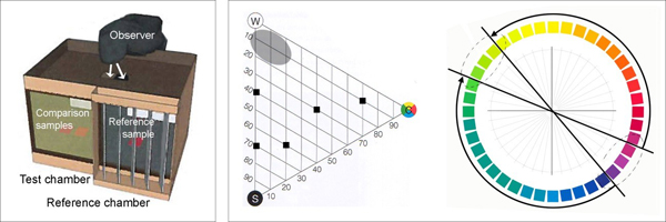
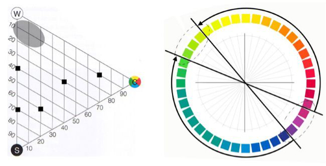
Figure 1: A: Illustration of the model. B: To the left; approximate area where the nuances proved sensitive to hue shifts caused by glazings (shaded area). The points show tested nuances that did not prove sensitive to such shifts. To the right; principle of hue shifts.
All the tested glazings showed similar patterns for colour shifts. Surfaces with pale colours – with little blackness and low chromaticness – are very liable to shifts both in hue and nuance, whereas strongly chromatic, intense colours and dark colours tend to be much more stable.
The typical pattern for hue shifts is shown in the NCS circle; the pale colours seen behind the tested glazings in comparison with how they look in unfiltered daylight. The arrows shows the directions of the colour shifts; from a colour sample seen in daylight to the same colour sample as seen behind the test glazings. The figure shows only the directions, not the sizes of the colour shifts. The lines through the circle points to the violet and yellow-green “breakpoints” for the colour shifts. Different glazing can give various breakpoints. Within the oval, stippled areas, the colour shifts are therefore extremely difficult to predict.
Typical patterns for nuance shifts varies in different areas. Pale samples with nominally yellowish or greenish hues, tend to get the chromaticness increased when seen behind glazing, while nominal neutral greys tend to achieve a slight yellowish-greenish hue. For samples with nominal hues between red and blue, the opposite was found and the chromaticness was typically reduced. The palest light blue sample assumed a distinct chromaticness in a hue between yellow and green. All these shifts seem logical, given the fact that all glazings had an obvious yellowish-greenish colour and thus functioned as yellow-green filters for daylight.
Since the perception of a surface colour depends (partly) on the spectral distribution of light reflected from the surface, the comparison of spectral distribution of light reflected from a sample illuminated by glazing-filtered light with not filtered light should give a clue about the possible colour changes. Figure 5 shows spectral power distribution measured in the model in the same setting as visual evaluation in daylight laboratory at NTNU for 6 NCS-samples and for two situations: no glass and 3-layers low-energy glazing. The measurements were done in Feb. 2012 by Peter Nussbaum and Aditya Suneel Sole using the Spectroradiometer CS-1000 from Konica Minolta.
The results for 6 NCS-samples and for two situations: no glass and 3-layers low-energy glazing are presented in figure 5. The power of light is strongly reduced by the glazing in the whole spectrum. The difference between the spectral distributions of the grey sample measured with and without glazing shows clearly the physically measurable reason for the change of colour perception investigated by observers. The reduction in both ends of the spectrum is respectively 65% for blue and 70% for red while the reduction in the middle part of the spectrum is lower, i.e. 50%. Similar wave length dependent reductions may be observed for all other colour samples. This confirms the validity of results from visual examination, especially about colour shift from red and blue toward yellow-green.
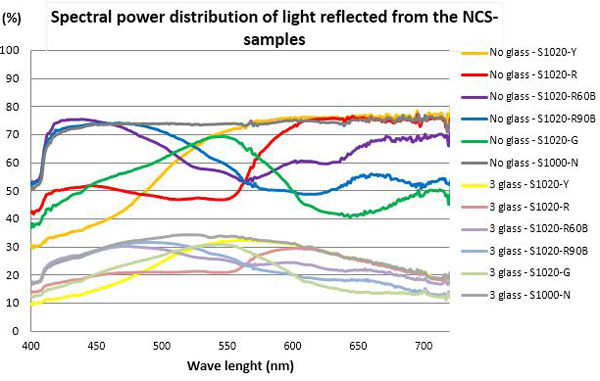
Figure 2 – Spectral power distribution of light reflected from the NCS-samples, indicated in percentage of a perfect white sample.
The results can be best observed at the NCS-diagrams in the figure 3. The colour shift in interiors caused by the window glass may have a significant influence at the perception of colour compositions, e.g. in the case an architect makes a colour composition of equi-luminant colours, some of them may shift hue (e.g. toward green) or look too dark (e.g. red) others too bright (e.g. yellow), something that may ruin the whole project. Another effect is the colour distortion of the view outdoors. We do not even need to open the window to distinguish that colours looks unnatural.

Figure 3. The colour shift in interior caused by the three-layer low-energy glazing.
Barbara Szybinska Matusiak, PhD, joined the Faculty of Architecture NTNU in 1994 as a research fellow. Her doctoral project was devoted to daylighting in linear atrium buildings at high latitudes (finished 1998). She designed the artificial sky and artificial sun for the new daylight laboratory (constructed 2000-2002) and the new full-scale room laboratory ROMLAB (finished 2006) at the same Faculty. She has been involved in many Norwegian and international scientific projects dealing with daylighting and artificial lighting in architecture. Her teaching activities (mainly master courses) are devoted to daylight/artificial light in architecture and to architectural design of interiors, where light and colour are the most important elements. She has developed, together with docent Karin Fridell Anter, the international PhD-course: Nordic light and colours. She has funded the interdisciplinary Light & Colour Group at the NTNU, Faculty of Architecture, in 2011: http://www.ntnu.edu/bff/lightandcolour
Reference
Fridell Anter, K. Häggström, C., Klarén, U., Matusiak, B. 2012 A trans-disiplinary approach to the spatial interaction of light and colour proceedings of the CIE 2012 conference in Hangzhou.
Matusiak, B. 2004. The impact of lighting/daylighting and reflectances on the size impression of the room: Full-scale studies. Architectural Science Review 47 (2):115-119.
Matusiak, B., K. Angelo, and K. Fridell Anter. 2012. Colour shifts behind modern glazing. Stockholm: University College of Arts, Crafts and Design. www.konstfack.se/SYN-TES.


