by Marietta Millet
Light and materials are inseparably connected, indeed they actually determine each other: neither is visible to the human eye until the two come together. For this reason, great architects have always also allowed themselves to be directed by the light in the choice of their building materials. They use light to draw out contrasts between different materials and they use materials that allow them to create a very specific distribution of light in a room.

Carlo Scarpa: Museo del Castelvecchio, Verona (1961–64). Light creates contrasts: the rooms in the museum are plastered with rough “Stucco alla veneziana”. Scarpa uses it to diffuse the light evenly and without reflections and to provide a contrast to the smooth, dark pedestals of the exhibits. Photo by Vaclav Sedy / Cisa A. Palladio.
Light and materials are mutually dependent on each other. Materials are key to understanding light in architecture because they directly affect the quantity and the quality of the light. Two qualities of materials – their finish and their color – are most important in this regard. Specular materials, such as glossy finishes, reflect light as a mirror does, which can result in reflected images of the light source being visible ‘on’ the surface. Matte surfaces, such as natural stone, wood, and plaster, reflect light diffusely equally in all directions. Of the three aspects of color – hue, value, and intensity – value is the one that determines how much light is absorbed and how much is reflected. A white wall reflects approximately 82 percent of incident light, a light yellow wall 78 percent, and a dark green or blue wall 7 percent. 1 Colored surfaces lend some of their hue to light that is reflected.
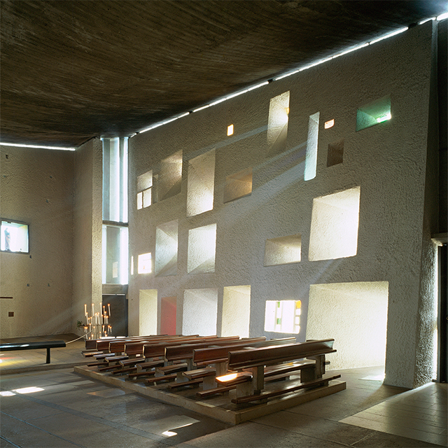
A change in materials can alter the feeling of a room and the level of illumination as well. The cheapest wad to increase the amount of light in a dark room is to paint the room surfaces white. A dark room, on the other hand, can be created either by using little light in a white room or through dark surfaces. With dark surfaces, a room will look dark during both daytime and at night. With light or white surfaces, however, the effect changes depending upon the light sources used. This effect can be exploited. For example, the interior surfaces of the chapel of Notre Dame du Haut at Ronchamp are white, but due to the small quantity of daylight admitted, perceptually the surfaces grade horn light gray to dark gray.
Materials are important emotionally in relation to light. The sparkle of glass. the glitter of gold mosaics, the depths of dark polished wood, and the shadows on white walls all hold emotional messages. some of them connected with cultural settings, some of them connected to individual recollection. Some regions have building traditions and materials that respond to particular local conditions, such as the stucco alla veneziana favored by Carlo Scarpa. Requiring a labor-intensive process of application with very particular materials, the stucco ‘over time takes on a softer, more moist look, a quality of fantasy and beauty.’ 2
Light emphasizing materials
Emphasis on materials is grounded in the interaction between light and material. Highlights arise from glossy materials reflecting discrete points of light. Definition of surface texture comes from grazing light. Revelation of the inner qualities of materials results from light passing through them. Dark shadows result from light being deflected from the surface, and from material absorbing light.

Patkau Architects: Newton Library, Surrey (1990). Material directs light: Patkau Architects carefully chose white ceilings and walls made of plaster board in their library, to guide the often weak and diffused daylight of British Columbia deep into the interior of their reading rooms. Photo by James Dow / Patkau Architects.
Light emphasizes the materials in Patkau Architects’ Newton Library at Surrey, at the same time as the materials emphasize light and foster its distribution. As the architects have stated, ‘because the light of the Vancouver area can be very soft, even weak, under the frequently overcast skies of winter, the robust light-absorbing character of heavy timber and concrete, in themselves, are not appropriate to distribute natural light into a relatively deep floor plate.’ The ceiling surfaces of the library have therefore been treated where needed with material that distributes light to the interior. Near the tall sloped north glazing, where the large area of glass provides abundant light for reading, the ceiling surface is the exposed underside of the wood decking. In such a situation, care must be taken so that the contrast between materials at the perimeter glazing and the sky is not too great, causing discomfort. Here the wash of daylight over the wood beams and onto the underside of the ceiling helps to mitigate the contrast at the edge as well as even out the brightness of the ceiling from the window wall to the center of the room. About midway between the glazing and the low center beam, sheet rock surfaces painted white were applied as the ceiling surface, better reflecting the daylight down to the area below. Each material is used honestly to do what is needed and no more, forming an economical building shell. The layering of materials discloses the role that each plays in the total realized construction.

Arata Isozaki: Museum of Contemporary Art, Los Angeles (1981–86). Light refines material: Arata Isozaki had panes of onyx fitted in the arched windows of his museum building instead of glass. The material that is rather dull looking from the outside shines beautifully with the light behind it and reveals the full beauty of its exquisite grain. Photo by Katsuaki Furudate.
Usually the glazing material is not the object of attention in a room. Special glazing materials, however, such as thin slabs of stone, can be emphasized by the way they transmit light. Under the barrel vault of the trustee’s board room, overlooking the library at the Museum of Contemporary Art (Arata Isozaki, 1981–1986) in Los Angeles, California, onyx has been used to glaze a semicircular opening and four windows below it. The onyx fits tight to the ceiling, so that the glow of the entering daylight is carried along the black concrete ceiling surface. Attention is called to the onyx as it is the brightest surface in the room. The thickness of the material saves the window from being a source of glare. Light reveals and celebrates the onyx, making it the identifying feature of the room.

Antoni Gaudí: Casa Batllo, Barcelona (1904). Material divides rooms into zones: the tiled cladding of this inner courtyard becomes gradually paler from the top to the bottom. In this way, Gaudí compensated for the successive reduction in the level of daylight towards the bottom. Photo by Marietta Millet.
In the central six-story light well in the Casa Batllo (Antonio Gaudi, 1904–06) in Barcelona, Spain, Gaudi designed the ceramic tiles that cover its surfaces to manipulate light. By modulating the hue, value, and texture of the tiles, he modified the qualities and quantities of light experienced in the light well itself as well as in the adjacent apartments. The tiles range in color from a deep blue through lighter shades of blue to an off-white. The deep blue tiles are placed in their largest concentration at the top of the light well, on the surfaces directly under the skylight glazing, interspersed with lighter tiles. The effect here is cooling, almost as if one were seeing the light underwater. At the bottom of the light well are placed the lightest tiles, interspersed with a few darker ones. In between, the colors gradually shift from dark to light. This distribution of the colored tiles evens out the perceived light gradient in the light well, establishing a balanced light. Thicker patterned tiles, which reflect the light from their corners, are scattered among the smooth ones along the entire height, adding a glint of sparkle. In addition to the use of materials to manipulate the light, the shape of the light well – wider at the top – and the sizing of the windows – larger at the bottom – serve to balance access to light for all residents. An additional geometric manipulation of the section of the light well is the insertion of balconies, with glass panels serving as flooring for the balcony and as a skylight for the room below The light that enters the apartments through the windows in the light well is therefore more equal than in the usual situation where the rooms at the top garner all the light and the rooms at the bottom are in shadow. Ventilation apertures are separate from the glazed windows, thereby adding more light to the interior when they are open.In the Casa Batllo, light was used in a thoughtful way with consideration for the well-being of the inhabitants, their need for light and air, and artful ways to provide them. Light was apparently considered at each step in the design process: concept, development of plan and section, window size and placement, surface shape and composition, and details. The tile work is not only beautiful, but also serves the purpose of modifying the daylight as it enters the building and is distributed to the apartments. Control and delight are both provided. The materials of electric lighting fixtures are as important as those of building surfaces which are acting as daylighting fixtures.

Erik Bryggman: Resurrection Chapel, Turku (1939–41). Material changes light moods: during the day, the brass lights in the nave of the chapel reflect the daylight in a dull shade of yellow. Evenings and night, they themselves fill the church with a warmer, golden-yellow light. Photo by Kari Koski.
In the Resurrection Chapel (Erik Bryggmann, 1939–41, renovated 1984) in the Turku Cemetery in Finland, the brass lighting fixtures reflect daylight with a cool yellow that warms to an amber glow when the incandescent lamps are turned on. The material and details of the fixture respond to the incandescent Iight. The vertical blades that baffle views of the lamp glow with the light reflected between them. The ‘crown’ of brass loops circling the top catch the light, as do similar ‘crowns’ higher up. The pools of gold light in the cool interior lend a warmth and points of attraction similar to the glow of a fire. The light furnished by electric lighting fixtures is contrasted with the daylight in both color and distribution. While the daylight washes the surfaces of the interior with fairly even light, the electric lighting fixtures act as points of focus.

Pitkänen, Leiho and Raunio: Lights in St. Henry’s Church, Turku (1980). Light changes materials: during the day, the glass reflector is almost transparent and provides a free view of the brick wall behind it. At night, it shines in the glow of the light source mounted below it as a yellow, opaque panel. Photo by Marietta Millet.
In Henry’s Church (Pitkänen, Laiho and Raunio, 1980) in Turku, Finland, the material of the lighting fixtures appears entirely different under daylight and under electric light. With daylight streaming in from large windows, the white screen material is almost transparent, and the brick wall shows clearly through it. When illuminated from below, the white material becomes a reflector, casting the light back down to the congregation. As it does so, it obscures the view of the wall directly behind it and casts a warm glow over the nearby wall surface. The material switches between revealing what is behind it and reflecting what is in front of it, as does a scrim curtain in theater productions. Through it, one becomes more aware of the difference between the nature of daylight and electric light.

Le Corbusier: Notre Dame du Haut, Ronchamp (1950). Light changes colour impressions: here, the irregularly positioned windows reveal the extreme thickness of the walls in the church building. The surfaces of the walls, which are actually covered in white plaster, have a different appearance in the back-lighting; they seem to be more pale grey to dark grey. Photo by Achim Bednorz / Bildarchiv Monheim.
Light muting materials
Materials can also be chosen to mute the effects of light, to make dissimilar materials appear similar, or to make the light seem unchanging. The shoji screens in traditional Japanese houses diffuse all the daylight that enters, whether the skies outside are sunny or overcast. The light is first shaded by the large overhanging roofs acting as a parasol, so that the interior muted effect is constant. The interior surfaces are carefully crafted to interact with the light. Junichiro Tanizaki explores this connection between light, materials and culture in his book ‘In Praise of Shadows’, in which he explains the traditional preference of Japanese people for shadows and soft, broken light:
“We do our walls in neutral colors so that the sad, fragile, dying rays can sink into absolute repose. The storehouse, kitchen, hallways, and such may have a glossy finish, but the walls of the sitting room will almost always be of clay textured with fine sand. A luster here would destroy the soft fragile beauty of the feeble light. We delight in the mere sight of the delicate glow of fading rays clinging to the surface of a dusky wall, there to live out what little life remains to them.” 3

Interior of a Japanese house. Material evens out the differences in light: characteristic of traditional Japanese houses are their far overhanging roofs and translucent ‘shoji’ walls, which keep the level of light in the rooms inside at a constantly low level during the entire day. Photo by Samuli Siltanen.
The ‘lume materiale’ (literally: ‘material light’) of Venice 4 seems to glow in Boston, Massachusetts, at the Isabella Stewart Gardner Museum (Willard T. Sears, 1899–1901). The wall was prepared in a similar way to the traditional Venetian stucco, and consists of plaster impregnated with color introduced by using a wash of pink paint. The light of Boston is not the light of Venice, but the appearance can fool the eye on certain days. The surfaces seem to glow in and of themselves so that the light is more real than the material. Likewise, in the exhibition of glass balls, Niijima Floats, by Dale Chihuly (1992 at the Seattle Art Museum), the light that is cast by the glass seems to be the point of the piece. It is not the balls themselves that are so important, but the patterns of light that they cast on the surface below. The material (of the balls) transforms the light which then transforms material (the resting surface).

Willard T. Sears: Isabella Stewart Gardner Museum, Boston (1899–1901). Light creates an affinity with a place: the Loggia in the inner courtyard is a detailed reference to Venetian models, and even the plaster was mixed to a Venetian recipe. However, the result is only convincing to the human eye when the daylight has that same typical silvery-soft atmosphere as in Venice. Photo by Marietta Millet.

Dale Chilhuly: Niijima Floats (1992). Material transforms light: in this installation at the Seattle Art Museum, it was less the glass balls themselves that were at the fore than the continuously changing light reflections they threw on the surfaces of the room. Photo by Marietta Millet.
Louis Kahn was very aware of the nature of a material’s response to light. Kahn’s selection of concrete and travertine as materials for the Kimbell Art Museum (1966–1972) in Fort Worth, Texas, was related to how their surface characteristics shaped that response:
“Travertine and concrete belong beautifully together because concrete must be taken for whatever irregularities in the pouring’are revealed. […] Time, he believed, would unify all materials eventually, but the architect could achieve unity by carefully choosing certain materials-wood, travertine, concrete – ‘which are so subtle that each material never ruins the other […] And that’s why the choice’.” 5

Louis Kahn: Kimbell Art Museum, Fort Worth (1966–72). Light modulates material contrasts: the surfaces of the walls in the museum are made of travertine, the arch of exposed concrete. According to the direction (direct or indirect) and nature of the light (daylight or artificial light), either the contrasts between the materials are emphasised or the materials appear to blend into each other. Photo by Roberto Schezen / Esto.
The travertine, unfilled and unpolished, has certain characteristic ways of reacting with light that complements the reaction of concrete to light. As the light changes – outside and inside – the surfaces of the two materials shift subtly in relationship to each other. First one seems warmer, then the other does. First one appears to be lighter, then the other. One seems to have a glossy surface, and the other a matte finish, and then they switch. One looks more mottled, then the other one does. The surfaces respond to the changing light. Light is the real material here.
Marietta Millet is Professor Emerita in the Department of Architecture at the University of Washington, where she has taught undergraduate and graduate design studios, lighting and color seminars, daylighting and electric lighting, climate responsive design and building performance. She was a partner in Loveland/Millet Lighting Consultants and is the author of the book Light Revealing Architecture, published in 1996 by Van Nostrand Reinhold.
This text was reprinted from the book ‘Light Revealing Architecture’ by Marietta Millet, © 1996, with kind permission of John Wiley & Sons, Inc.
This article is featured in D/A Magazine issue #3, for more information visit da.velux.com.
References
1 Reflectance can be calculated by measuring the incident illumination in foot-candles (1 foot-candle = 1 lumen per square foot) on a surface and then, under the same lighting conditions, measuring the luminance in foot-lamberts (1 foot-lambert = about 3.426 candela per square meter) of the surface. Reflectance is luminance divided by incident illumination.
2 Zambonini, Giuseppe: ‘Notes for a Theory of Making in a Time of Necessity’, in : Perspecta 24, p.3–23. Recollections of Eugejio de Luigi, a longtime collaborator with Carlo Scarpa
3 Tanizaki, Junichiro: ‘In Praise of Shadows’,Newhaven 1977, p. 18
4 See also: Marco Frascari: ‘The Lume Materiale in the Architecture of Venice’, in: Perspecta No. 24, 1988
5 Interview with Louis Kahn, by Marshall Meyers in 1972. Reported in Loud, Patricia Cummings: ‘The Art Museums of Louis I. Kahn’, Duke University Press, Durham 1989
6 Millin, Laura (ed.): ‘James Turrell: Four Light Installations’, The Real Comet Press, Seattle 1982, p.18


