by Francesco Anselmo and John Mardaljevic
Our experience of the world is strongly determined by the amount and quality of daylight that we receive. Modern methods of daylight mapping can tell us fascinating stories about the availability of natural light in different parts of the world, and on the diverse factors – both natural and man-made – that influence it.
Astronomers and scientists have told us for some considerable time about the angle of the Earth’s axis to the sun, the direction and speed of rotation of our planet, the characteristic irregular distribution of land masses and oceans that defines our geographic knowledge.
Sixty years of space exploration and the images sent by a constantly increasing number of artificial satellites (there are more than 3,000 currently in orbit around the Earth) have strongly ingrained in our personal and collective memory the emotional view of our blue planet from space. But the experience of life on Earth is still perceived from the vantage point of space travellers confined on the thin crust of a planet orbiting at the average speed of 107,200 km/h around a yellow dwarf star, the Sun.
The rotation of the Earth around its axis defines the sequence of light and darkness on the surface, creating the concepts of day and night. The light of the day becomes what we humans call daylight.
Daylight is composed of the light of the sun (small directional source) and the light of the sky (large diffuse source). Skylight is sunlight that is scattered by the air – without an atmosphere, the daytime sky would be black, as it is on the Moon.
The surface of the Earth (with its materials, orography and vegetation, but also with the results of anthropic activities) interacts with the energy from the Sun, creating different events in the atmosphere that, in the long term, characterise the local climate and with it also the luminous climate, that is the climate that interacts with visual perception.
The need to understand and predict weather, mainly for agricultural and socio-economic reasons, has developed climate science and created a network of weather stations that sense, log and monitor a number of environmental variables on the ground. Stationary satellites have also been deployed to gather weather patterns remotely, allowing us to extrapolate the ground readings, with good accuracy, to any location on Earth.
These data can be filtered statistically and visualised to give an insight on the global climate history and future trends.
The maps presented on these pages attempt to display the luminous climate at planetary scale. They make use of the NASA SSE (Surface Meteorology and Solar Energy programme) weather dataset, which is based on monthly data collected over a period of 22 years (between 1983 and 2005 by satellite measurements) and projected onto a grid of 1°×1° tiles over the world (1° equates to approximately 111 km on the surface of the Earth).1
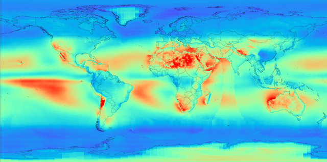
The maps show the strength of sunlight compared to the light from the sky for a typical year.
The annual number of clear sky days is represented in blue − the stronger the blue, the higher number of clear skies. The dark blue areas are the places on Earth where sunlight is prevalent.

Figure 2. Annual number of clear sky days.
The direct-to-diffuse irradiation ratio map provides more insight into the difference in magnitude between the irradiation from the sun compared to the one from the sky. This map only shows the ratio between the different kinds of annual cumulative radiation and therefore contains no information about seasonal variation. However, it is useful for understanding prevalent daylighting conditions and whether daylight design should address mainly shading or diffuse illumination.
It is instructive to read these maps in conjunction with the map of forest coverage. There is, in fact, a direct correlation between areas with forests and areas where there is prevalent cloudiness. This is due to evapotranspiration (ET), that is the sum of evaporation and plant transpiration from the Earth’s land surface to the atmosphere. Evapotranspiration is an important part of the water cycle, the continuous movement of water on, above and below the surface of the Earth.

Figure 3. Global map of forest coverage. Forests produce clouds due to water evaporation, thus exerting a considerable influence on the climate and the availability of daylight in a region.
The balance of water on Earth remains constant over time, but individual water molecules move from river to ocean or from the ocean to the atmosphere, by the physical processes of evaporation, condensation, precipitation, infiltration, runoff, and subsurface flow. In doing so, the water becomes ice or vapour, thus exchanging heat − for instance, cooling the environment when it evaporates, or warming the environment when it condensates. These heat exchanges strongly influence climate.
The idea of using vegetation to read the local climate is not new. It was first used by the Russian-German climatologist Wladimir Köppen in 1884 to devise a climate classification system that is still one of the most widely used.

Figure 4. World map of Köppen Geiger Climate Classification.
The system is based on the concept that native vegetation is the best expression of climate. Climate zone boundaries have been selected using the vegetation distribution and combining average annual and monthly temperatures and precipitation, and the seasonality of precipitation.
Zooming in to the Map
The relationship between orography and climate is remarkably evident for the Andes. In fact, the relief of the Andes allows a variety of different climatic zones to develop within relatively short distances.
This is particularly true of Chile. Its large expanse of latitude, spanning 4,300 km and 38º in latitude, and the presence of the Andes make it the nation with the most micro-climates on Earth. While the northern region is extremely dry, and includes the Atacama Desert and many places where rain has never been recorded, the central region is a fertile area with a temperate climate. The southern region by contrast is cold and rainy, with icy fjords and glaciers at the southernmost end.

Figure 5. Direct-to-diffuse irradiation ratio in South America. The map clearly shows how isolated the climate of Chile is from the rest of the continent, and what differences exist between the dry north and the humid, cold south.
Climate has played an important role in defining the Chilean cultural identity. Apart from the desert area, the occurrence of cold and cloudy winters, similar to those experienced in northern Europe, has influenced the attitude of people towards a work ethos in society, to the point that Chileans generally distrust the idea of a tropical culture, which is seen as encouraging indolence and underdevelopment.
Another interesting phenomenon is the fact that, in temperate and humid climates, the land areas show a prevalence of cloudy conditions, while the sea has sunnier skies. Conversely, in desert areas it is typically the opposite. This is true for instance, of the Sahara desert, the Atacama desert, Namibia and the desert areas of North America and Australia.
However, it is also true that an extremely low level of cloudy skies is evident for Antarctica. Hence the classification of this continent as a desert – a frozen desert of snow, in fact, with little or no precipitation.

Figure 6. Direct-to-diffuse irradiation ratio in North and Central America. As in most of the Earth’s humid and temperate zones, the sky is often cloudy over the land, whereas, over the sea, the weather is usually sunnier. In the desert regions of California,however, the opposite is true.

Figure 7. The map of North Africa shows a similarly strong contrast between land and sea: over the Mediterranean and the Red Sea, the sky is clear; over the coastal regions, however, precipitations can occur more frequently. In the interior of the Sahara and the Arabian Desert, on the other hand, direct irradiation is prevalent (cloudless sky).

Figure 8. As in desert areas, the sky over the Antarctic continent is normally cloudless, in spite of the extremely low temperatures.
On closer inspection, the luminous climate maps can tell interesting stories about humans, too.
For instance, why is sunlight so weak in China?
It is true that China has cloud forests on the Yunnan Plateau. Cloud forests are tropical or subtropical forests characterised by low-level cloud cover that can be persistent, frequent or seasonal and that can therefore influence the prevalent daylight conditions in these regions.
But it is also true that most of the world mining and industrial manufacturing has recently been concentrated in this area of the world because of physical resources location and global socio-economics, combined with an energy-generation strategy largely based on coal, and the occurrence of natural seasonal phenomena such as Asian Dust. This has had a strong impact on air quality and pollution levels in recent years, to the point of forcing the Chinese government to take action in January 2013, ordering factories to reduce emissions and spraying water at industrial buildings to help contain the haze that has covered the region. Schools were ordered to suspend outdoor activities and citizens urged to “take measures to protect their health”.
This situation had already been described in a World Bank report in 2007 (Cost of Pollution in China), which stated that 16 of the 20 most-polluted cities in the world are in China, and that the cost of air and water pollution is between 3.5% and 8% of the Chinese GDP.

Figure 9. Direct-to-diffuse irradiation ratio in South Asia. What is striking is the large amount of direct solar irradiation over the Himalayas and the extremely low levels in large parts of China. These levels are only partially due to natural phenomena; man-made smog is also a large contributing factor.
The maps clearly show that the impact of pollution is also evident from a daylighting and irradiation perspective, with a noticeable reduction in direct solar radiation and illumination to levels comparable to those found in tropical forests or in sub-polar regions.

Figure 10. PM 2.5 Charts January 2013.Amount of fine particulates (2.5 microns or less in diameter, measured mid-mornings) in different cities of the world. The bar diagram shows the monthly averages for January 2013.
References
Weather and Radiation Data from NASA:
http://eosweb.larc.nasa.gov/sse/
Monthly and annual averaged values for a 22-year period (July 1983 – June 2005)
NASA Earth Observations:
http://neo.sci.gsfc.nasa.gov
http://earthobservatory.nasa.gov/GlobalMaps/
Köppen Geiger Climate Classification:
http://gpcc.dwd.de
http://loeppen-geiger.vu-wien.ac.at
Kottek, M, J Grieser, C. Beck, B. Rudolf and F. Rubel, 2006: World Map of Köppen – Geiger Climate Classification updated. Meteorol. Z., 15, 259–263.
Francesco Anselmo is a Senior Lighting Designer at Arup in London. He holds a PhD in Environmental Physics and a degree in architectural engineering. He is an expert in numerical simulation and visualisation systems and develops computer tools for lighting design, building simulation and interaction design.
John Mardaljevic is Professor of Building Daylight Modelling at the School of Civil & Building Engineering of Loughborough University in the UK. Since the 1990s, he has pioneered the application of climate datasets for daylight and solar modelling on all scales, from the urban to the single building. He currently serves as the UK Principal Expert on Daylight for the European Committee for Standardisation.
This article is featured in D/A magazine #19, for more information visit da.velux.com.


